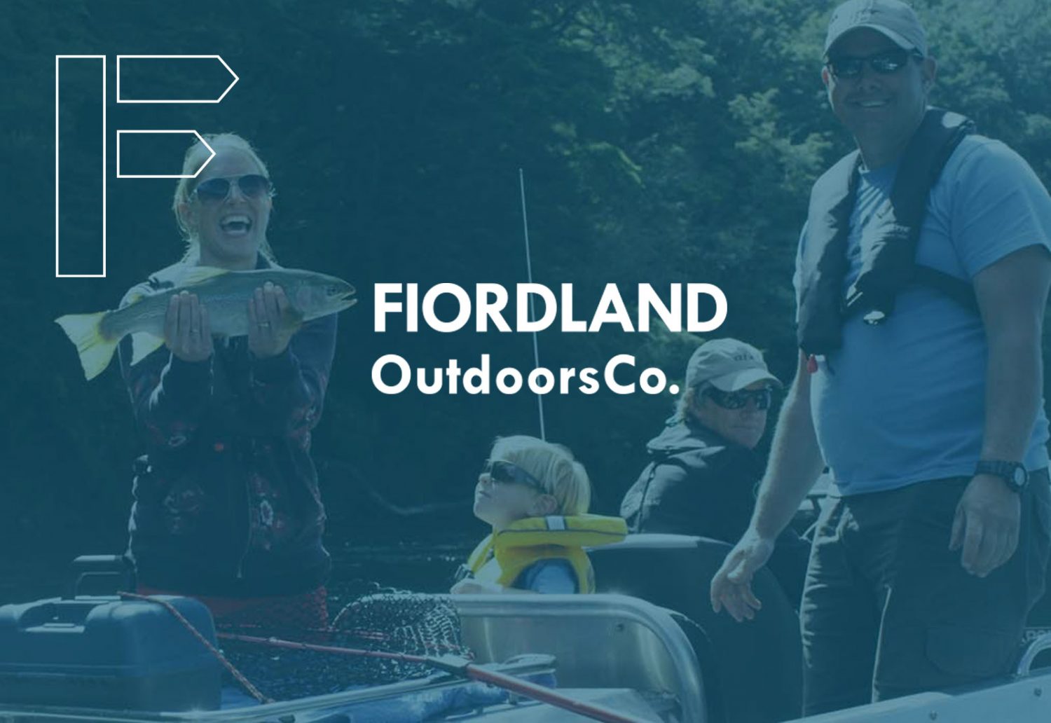
Travel Company Website
A stunning portfolio website showcasing New Zealand with a custom mega-menu
Adventure, outdoors, experience and New Zealand. These keywords were the driving force behind this picture perfect, custom built WordPress website. Fiorland Outdoors Co. is a newly integrated company, serving as a way to deliver ‘top notch’ outdoor experiences in this breathtaking New Zealand region. Working alongside the team at Harmonica Agency, we custom built a responsive and streamlined navigational website showcasing the experiences and trips on offer.
Custom Mega-Menu
Website menu navigation should be simple and intuitive. The menu is there to help us find content. A difficult menu navigation could easily deter visitors from a website. This is something we do not want for our clients. A visitor’s expectation is to find an answer to their question. In our experience, not every website does this. Designing a winning navigation menu is one of the most important aspects in our planning stages. Fiorland Outdoors Co. has a responsive navigation by Places, Length of Trip and Experiences. As a user hovers over either menu heading, an extended list appears with images of each Place, Trip or Experience. The addition of imagery adds to the adventure, outdoors and experience of one of the most dramatic areas of New Zealand. The extended menu list also serves as a quick reference to the locations on offer.
Interactive map function
As an adventure guide, we custom built an interactive map to display the location of each place, trip and experience. With a little imagination and unique user experience this simple yet functional tool created a visually stunning section and was consistent with informing visitors about what Fiorland Outdoors Co. offers. Visitors can explore the Fiorland area with an illustrated map, adding a touch of fun to the site.
Responsive Website Design
Responsive design is easily the best way to ensure your website is read by visitors on any device. Responsive Web Design is about using HTML and CSS to resize and move the content to make it readable on any screen. The responsive functionality is the best way to navigate on a mobile without taking up too much space, zooming in and out is frustrating and out-of-date.
Italics Bold works with you from an initial idea through to a fully functioning custom website, program, system and application. Contact us today.